GOWrite has been looking quite dated for many years. This may not impact the way GOWrite can be used, but it definitely makes it less enjoyable.
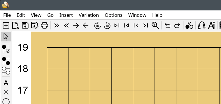
Now I have integrated new skin to GOWrite, and this makes GOWrite look reasonably modern again!
There are also new icons, also much more modern than the inconsistent set of old icons. As the new icons are purely vector graphics, they also scale properly in different displays.
Below is sample of the new look.
